Through the years as a designer I’ve seen a lot of companies struggle with their Visual Identity as more and more platforms are available for them to reach their potential target group. Companies today have to take in consideration that their brand is not just visible in their print ads, on their stationary, business cards and office fronts.
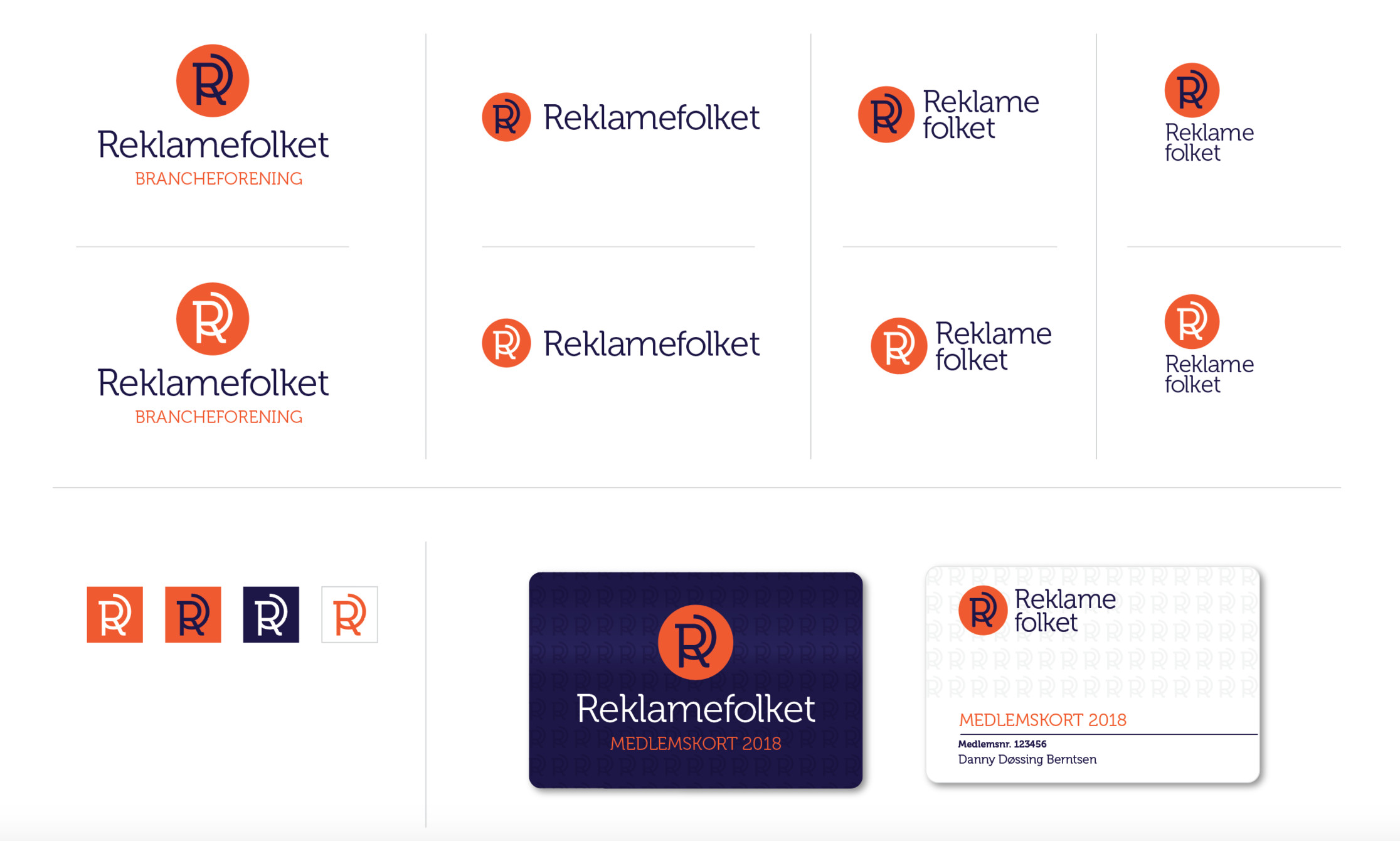
That’s why it’s important to design your company’s identity in a flexible way. The logo is the cornerstone of your brand and companies tend to be very conservative when it comes to their logo. Personally I like logos that are versatile and playful in their design. A logo should be able to function on print materials as well as on online platforms. Today it’s not only on your webpage that you use your logo but also on a wide range of social media platforms and advertising formats. Your beautiful typography style logo is perhaps completely lost on some of the social media platforms and then it could be nice to have an iconographic version that works well in really, really small formats.
Versatile designing
One part of my approach to logo design is to think of all the places where the company needs to be present and design the logo with that in mind. Although that it not always the case it is certainly a big influence in the design process. A typography style logo with a combination of some kind of iconographic form is my preferred style of logo. The iconographic form doesn’t have to be placed on the side or on top of the typography it can also be part of the typography and of course you can use all of these combinations at the same time, depending on where you use the logo. This way you always have some sort of unique visual representation of your main logo that can be used as an avatar, app icon or a favicon for that matter.

Other things to take in consideration for a flexible visual identity is your colour scheme, photography style, illustration style and the tone of voice your company communicates in. All of these things can be used in different ways and combinations depending on the target audience.
Taste the rainbow
A company can have its main colours that it uses for external use and to represent a solid identity that it takes ownership of, but when its time to communicate internal it can bring secondary colours in play to represent different departments or sections of its company. This is also very useful when you bring infographics to play or when you perhaps launch a new product that needs to be different from your first product but stil work with your main identity. This way you can plan ahead by making a versatile, harmonic colour scheme from the start that you can use if your company grows in directions that you didn’t expect.
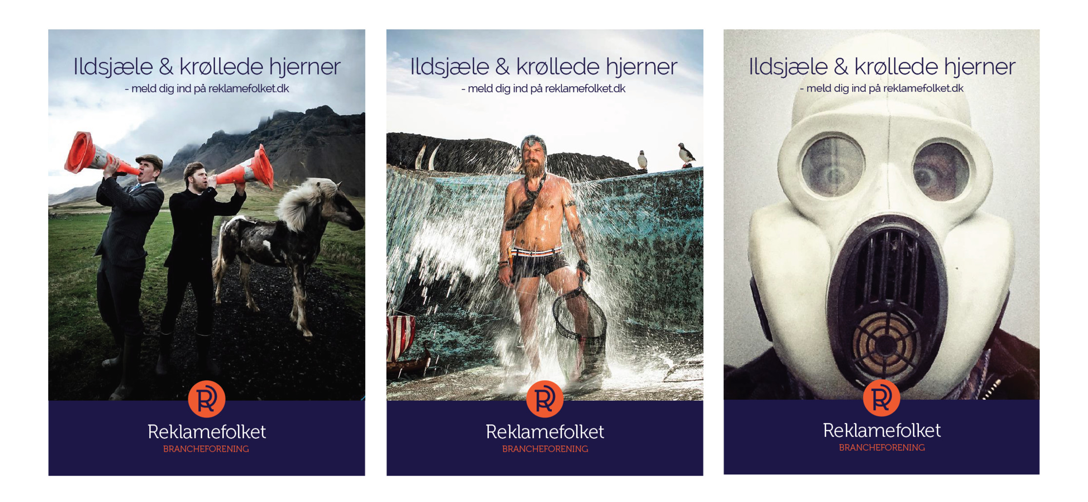
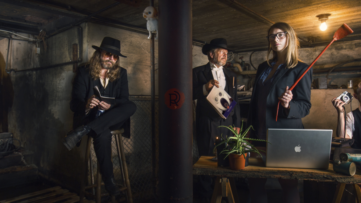
Likewise planning ahead with illustrations and photography style you will be ready to communicate to different target groups in different ways. Not all your corporate pictures have to be in the same style as your product pictures, when their perhaps used for two or more totally different target groups. Although its always good to have some sort of a visual thread that combines the whole identity.

So… plan ahead, be playful, flexible and versatile to make your brand ready for the ever complex corporate landscape of tomorrow.

